

This Zoho CRM widget is a prime example of how integrating data from multiple sources can enhance data visualization and decision-making in business operations.
The widget in question draws information from two distinct modules: the Sites module and the Collections module. These modules are crucial for our client’s operations, as they track various metrics related to their sites and collections. By merging data from these modules, our widget presents a comprehensive overview in a table view format.
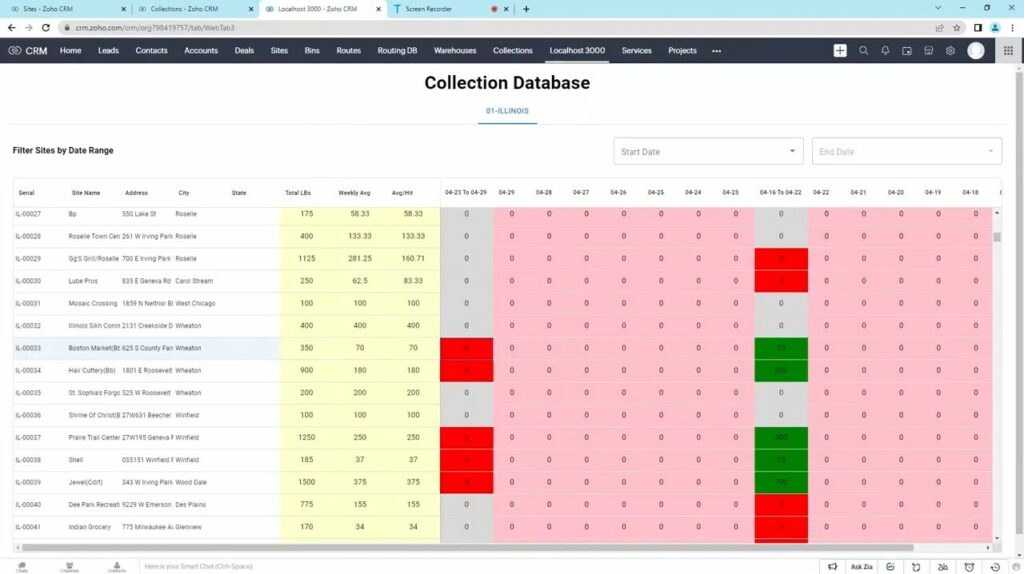
Let’s break down the components of this widget for a clearer understanding:
Site Representation: Each row in the table corresponds to a specific site, providing a snapshot of its performance in terms of collections.
Collection Metrics: The columns are dedicated to different collection metrics:
- The first column indicates the total number of collections for each site.
- The second column shows the weekly average of collections.
- The third column represents the average collections per hit, offering insight into the efficiency of collections.
Historical Data: An essential feature of this Zoho CRM customization widget is its ability to display data over a two-week period. Users can easily scroll through the table to view historical performance, which is crucial for identifying trends and patterns.
Weekly Collections: Another column presents the total number of collections for each corresponding week. This allows users to quickly assess weekly performance and identify any fluctuations.
Data Filtering: Users can filter the sites based on specific criteria, such as a starting and ending point. This filtering is visually represented by a change in color, with a purple or violet hue indicating the filtered sites.
Overflow Indicator: In cases where a site experiences an overflow, the widget marks it with the designated violet color. This visual cue helps users immediately identify sites that may require attention due to exceeding expected limits.
Performance Indicators: The widget employs color coding to signify changes in collection numbers:
- Green indicates an improvement in collections compared to the previous week.
- Red signifies a decrease in collections, alerting users to potential issues or areas for improvement.
Through these features, the widget serves as a powerful tool for data visualization and analysis. It enables users to combine data from different sources, visualize it in a coherent manner, and make informed decisions based on the insights provided.
The practical applications of this widget are vast. For example, managers can use it to monitor the performance of various sites, identify trends in collections, and allocate resources more effectively. It can also aid in setting targets and benchmarks for future performance, as well as in identifying areas where improvements are needed.
In conclusion, this widget is more than just a tool for displaying data. It’s a comprehensive solution that enhances the decision-making process by providing a clear and concise overview of key metrics. Whether you’re looking to improve operational efficiency, track performance trends, or make data-driven decisions, this Zoho CRM widget is an invaluable asset for any business.