

You can access your Zoho sites. Site builder, have zoho.com/sites, and you can access your website builder by clicking on the access Zoho sites button. Otherwise, if you want to look at the templates we provide, you can go right ahead by clicking on templates. This will take you directly into our template library, where we have a whole bunch of different templates that we provide, and they are all mobile optimized and categorized based on industry. You can choose from a whole bunch of templates here, and they are segregated based on use or industry. If you look at architecture and interior, we have different templates, or you can take a look at them over here. Once you hover over a template, it’ll show you a little preview as to what the template holds. You can also click on the live demo to take a look at how it will appear on different devices and how it will appear on desktop devices.
And then how it would appear on tablets and other handheld devices that you can see and then how it would also appear on mobile devices, such as smartphones. You can take a look at the template. And if you like what you see, you can click on this template, which will take you directly into the builder. But for the sake of this demo, there is a website that I have already built. Here is one using the restaurant template from our template library. I’ve, of course, just added a few give-or-take elements for the sake of this demo. But basically, it is the same template you found in the template library. This is what all of our templates look like, and so it has a huge banner area which is very useful for you to convey, whatever message it is, which is about the kind of business you do or what you are about. This would be the place to display any graphics or imagery and where you can put your important content. Then you can see that the page is separated into various sections, so multiple sections are stacked on top of each other, and each section has elements. You have like the heading portion you have the paragraph or text area. You can also add images, and each of them comes with customizable options; each element in each section has its toolbox, so you can go and edit everything to the manner that you would like it to appear. Here is a section and within this section, we have different customization tools that you can use. Once you click on this, customization option, the toolbox appears, and these are the general settings for your section. You can choose from various background types, and the background type is based on the theme color that you are using. You can also select the different types of themes you want. And likewise, you can choose to add background images or video. Here is a demo video that we provide. Of course, you can always add videos you would like to by clicking on change video and uploading one from your computer.
Sections
Sections have other tools, so you can see the different types of tools we provide and use them according to your client’s requirement. Sections also have this new feature called the shaper. This enables you to add various patterns to the background of your shapers so you can choose from our list of shaper designs. For instance, if we pull up circles, these are the different types of designs you can add; you can choose in circles. We have a lot of other designs to choose from. Let’s take this one for example, and you can always flip it, so it doesn’t have to be in the lower right-hand corner. You can flip them to anywhere you would like to be; you can also choose to increase or decrease their transparency based on your requirement. What this does is it adds a different dimension to your design without just having to have all these bolts up stats on top of each other. You can also add these types of design elements.
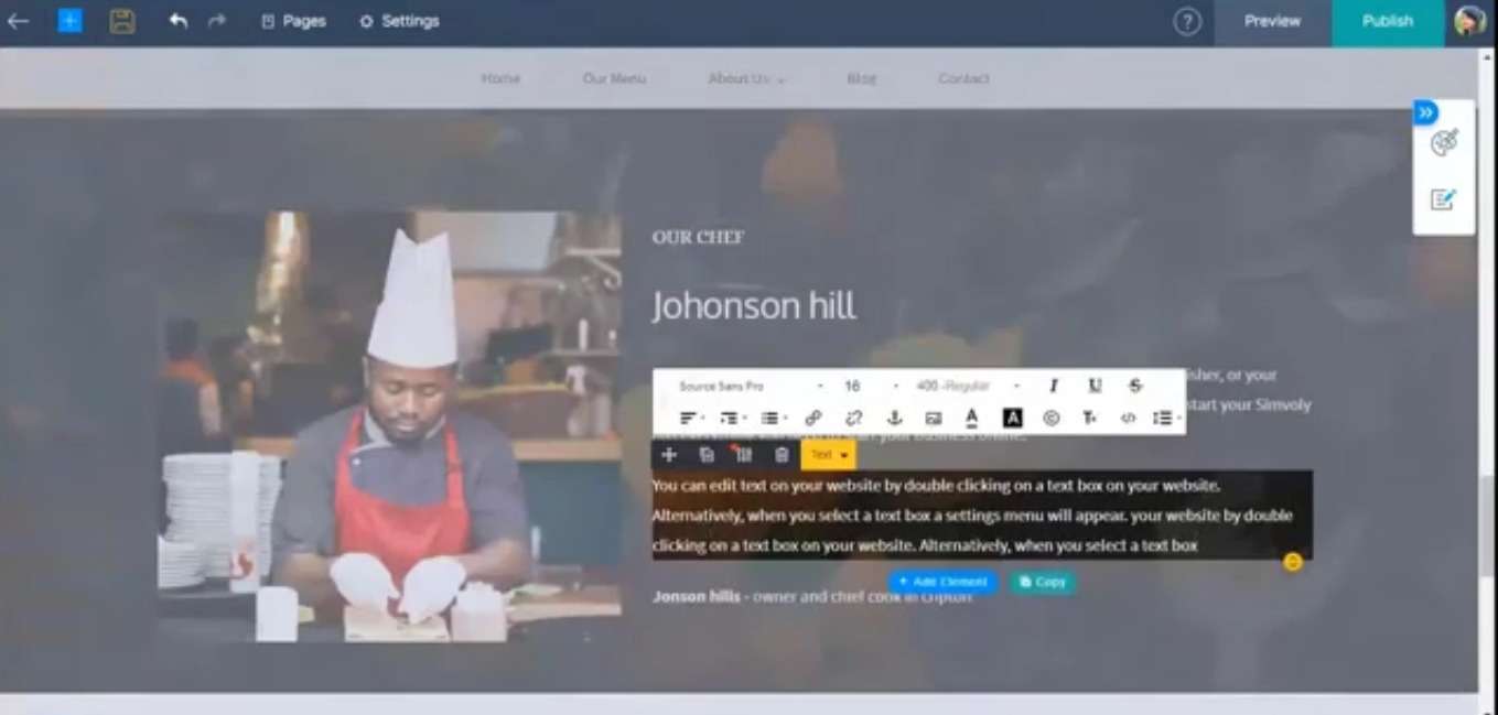
You can also choose if you would like it displayed on your tablet and if mobile devices are not. So if you choose not to be, it will be displayed in the desktop version of your website, and you can also edit the transparency that you would like for it to appear on the smaller devices. And again, if you choose not to have your shaper, you can go back and click none, so this is basically the different types of section editing that you can provide for each section, and then we have very elements specific types of editing options as well. Given the fact that this one is a text element, you will have customization options.
Given that this one is a heading, you can choose the different types of headings you want based on how you want your website to be viewed on search engines. It would be, it would be good to go with an h1 or an h2 tag. If it is an important piece of content that you want to be crawled, you can also go with alignments that heading styles, and it’s very dependent on the different elements you apply likewise for.
In the button element, you can see that we have different types of customization, so it’s very pertaining to that kind of element and the kind of customization options that we provide. If you want to look at the different types of options for the banner, the banner works differently. Of course, it is not like the section, so banners have like slides so you can add various banners, and they’ll slide along like a carousel. So, this can be one slide along with many others. You can also choose if you want the background to be an image or a video or solid color and the theme, depending on your chosen color. You can also choose if you want your banner to have like a fixed or a scroll component. So now, it is on scroll, so if you choose fixed, it’ll be fixed in one place. And you can see how it creates a little bit of parallax, a kind of dimensional design.